How to Create a Gallery Wall Layout Idea That Doesn’t Feel Overdone
Creating the perfect gallery wall layout ideas isn’t just about arranging random frames in a pretty way. It’s about designing a visual story that feels personal, balanced, and intentional. A well-planned gallery wall should invite guests to observe, showcase your unique style, and give your space an effortless, curated look. No matter the space you’re working with, whether it’s a small apartment or a living room centerpiece, these tips and tricks will help you turn your blank wall into a work of art.
Balance Art and Photos, Mirrors, and Objects
A gallery wall with proper balance tells a story about you and your home. It’s not just about having art prints or home decor. Mixing in mirrors, objects, and shelves can instantly add depth and dimension to your living space. Combining different types of pieces creates moments of visual diversity to look at. Keeping the overall display from feeling too busy or one-dimensional is the balance that mixing different pieces can bring. Making your gallery a blend of materials and textures turns your wall into something interactive that tells a story and can keep the room feeling alive.
Include Family, Friends, and Destinations
A gallery wall is the perfect place to show a bit of heart. Think of it like a visual scrapbook that celebrates memories and the people you love. Include a mix of subjects like family vacation photos, pics with friends, and personal travel photos alongside favorite prints. You don’t need every image to feature a face, but sprinkling in personal touches creates warmth and connection. Avoid generic filler pieces or mass-printed stock images. This isn’t Starbucks, so don’t decorate it like it is. Instead, choose photos that make you smile or recall places that inspire you. Even if it’s just one or two meaningful photos mixed in with different art prints, these details make all the difference. Your gallery wall should look like you live there.
Ensure Each Piece Is Handpicked
Every piece on your wall should earn its place. Think of it as curating your own mini art exhibit. Buying an Etsy kit of trendy wall art might be the easy route, but the result often feels flat and impersonal. This shouldn’t resemble your freshman year dorm. Instead, take time to select individual pieces that resonate with you. That could mean thrifting a vintage print, framing a postcard from a trip studying abroad, or displaying your favorite photo booth film. Each piece should have some element of story or meaning, even if it’s small. Be intentional with it. Every frame and artwork should feel like something you chose, not just something that happened to fit the wall or that your mom would have in your living room at home.
Mix and Match Frames
One of the simplest ways to add interest and depth to your gallery wall is by playing with frames. Think of frames as part of the art instead of just borders. Mixing materials like wood, metal, gold, or painted colors creates a subtle contrast and keeps the overall look from feeling sterile. For example, pair a natural wood frame with a brushed gold one, then mix in both black and white and colored photos. Variation in color and texture amplifies dimension, just make sure to keep the same tone and color scheme to keep things cohesive.
If you have bold or detailed artwork, opt for simpler frames to keep attention on the piece itself. For minimal art or photography, don’t be afraid to experiment with unconventional textures like fabric-wrapped mats or antiqued finishes. A beautiful frame can enhance your art and pull out accent colors from the surrounding décor. It’s all about finding that balance between cohesion and adding a playful touch.
Create a Focal Point and Vary Frame Sizes
Visual rhythm is key. Unless you’re intentionally going for a symmetrical grid, it helps to anchor your display with a central focal point. This could be one large standout piece like an abstract painting, an enlarged favorite photo, or even a mirror. Start with your chosen focal point and build outward, balancing other pieces around it. Working from the center ensures your layout feels grounded.
Varied frame sizes add movement and flow, guiding the eye naturally across the wall. Combining small, medium, and large frames adds motion and makes the wall feel organic, inviting, and custom.
Map Out Placement Ahead of Time
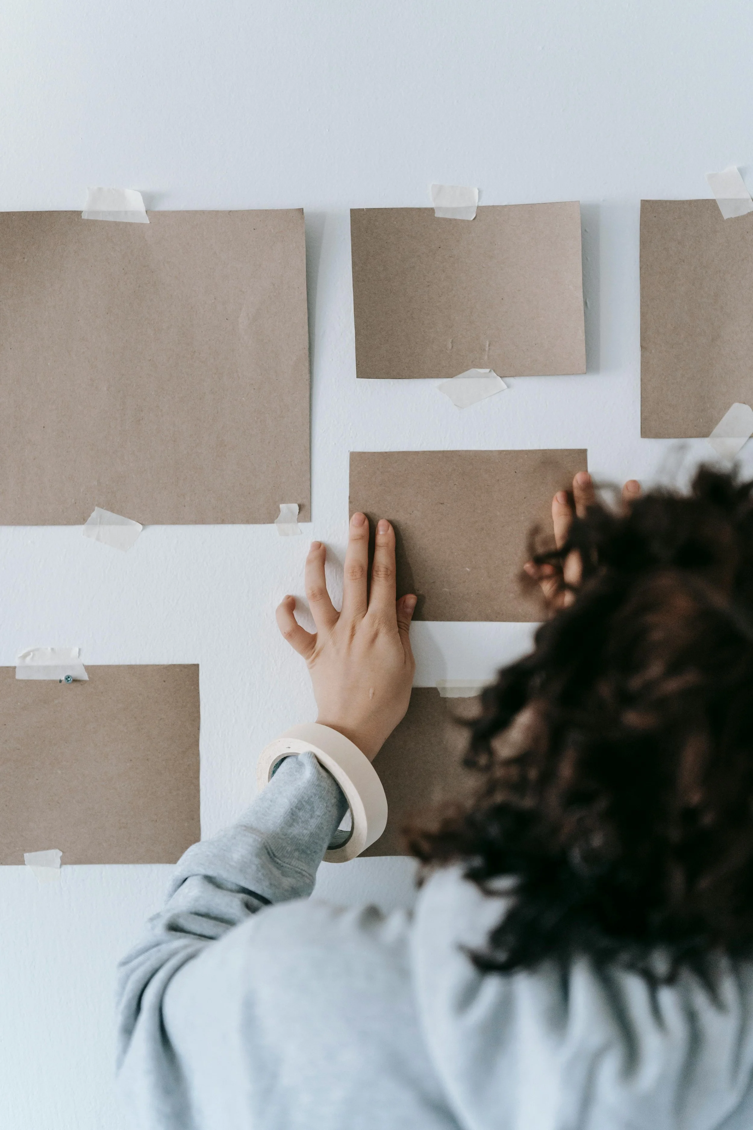
Before you even think about hammering a nail, lay everything out. Testing your layout first prevents a lot of unnecessary patchwork later. One simple trick: use painter’s tape or cut out paper templates that match each frame’s dimensions. Then, arrange those templates on the wall to see what works best before making anything permanent. Adjust spacing, swap out shapes, and play with alignment until it feels just right.
If you’re tight on resources, spread the frames on the floor in roughly the same configuration as your wall space. Step back, take a photo, and adjust until the arrangement feels balanced. It’s much easier to tweak on the floor than on the wall. Planning at this stage will save you a lot of frustration later and ensure your gallery looks polished and intentional instead of random.
Hang Properly (Nails or Command Strips)
How you hang your artwork can make or break the final look. If your walls allow it, nails and brackets are often the sturdiest option. To mark nail placement accurately, put a small dab of toothpaste on the back of the frame’s hanging bracket and press it lightly to the wall where you’d like it, and there you go, a perfect guide mark for your nail. Once hung, use a level (or a leveling app) to ensure each frame is even, and maintain consistent spacing between pieces.
If you’re renting or dealing with concrete walls, command strips are a great alternative. They’re apartment-friendly, removable, and surprisingly strong when used correctly. Attach them to the frame first, check the level, then press firmly against the wall. Patience and precision here pay off. No one wants a crooked gallery wall sliding down overnight.
Invest in High-Quality Printing and Frames
Stunning pieces deserve a stunning presentation. Even if you’re working with a student or entry-level budget, investing in high-quality printing and framing makes a huge difference. The higher the quality, the better the color and sharpness. If cost is a concern, consider printing or investing in a few key pieces and have those be the focal point of your gallery wall art ideas.
Well-made frames not only look better but also protect your art from damage over time. Check out my article on how to create a high-end look on a college budget for more details on this.
Height and Width Matter
The size of your room in comparison to the objects you’re displaying is a crucial factor. Proportion and placement are everything. A gallery wall should feel perfectly curated in its space, not awkwardly placed too high or crammed too low. In general, aim to have the center of your gallery wall art ideas sit at eye level, roughly 5 feet off the floor. Leave enough space between your display and nearby furniture, such as couches or tables, so that the art feels connected to the room without overwhelming it or looking forced.
If you’re lucky enough to be working with a larger room or wall, scale your gallery wall art ideas to the wall. A small arrangement on a huge blank space will look lost, just as oversized frames can overpower a narrow hallway. Step back and check as you arrange to make sure the wall feels in line within the wider space.
Choose a Cohesive Color Scheme
Finally, tie it all together with a thoughtful color palette. Look around your room. What colors already exist in your furniture, rugs, or curtains? Pull tones from those elements and echo them subtly through your wall art or frame choices.
Lighting also plays an important role, and I can’t stress this enough. Daylight is so desirable but can make colors appear cooler, while warm bulbs soften tones. As you curate, think about how natural and artificial light interact with your chosen pieces throughout the day. ALSO. Do not use overhead lighting. Lamps are a must. Choose “warm white" (2700K-3000K) LEDs to create a welcoming atmosphere. A cohesive color scheme ensures that your gallery wall feels like part of the room, not an afterthought.
To summarize…
A gallery wall is a reflection of your personality and creativity. It evolves as you do and tells your story as you live it. Start small, play with arrangement, and never be afraid to adjust or swap pieces over time. The best gallery wall layout ideas aren’t perfect; they’re custom and meaningful to you.
If you’re looking for custom pieces to add to your gallery, shop this custom wall art that’s personalized to all your favorite cities.